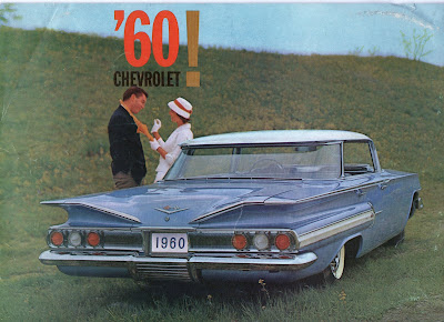
 The front cover.
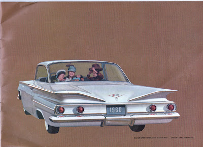
 The back cover. More to follow.
 Up until the mid 1960's car advertisements generally used illustrations to promote their products. This way they could manipulate the scale slightly. You'll notice that the cars appear bigger compared to the passengers than they really were.
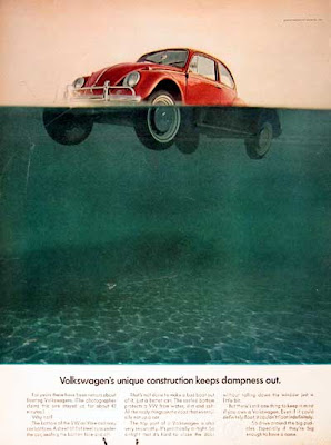
This all changed when Volkswagon started their campaign with simple photos and realistic copy.


Man, these were such stylish looking cars. The Corvette, I think, speaks for itself. But they were also deathtraps in an accident - the term "crumple zone" was unheard of at the time, and all that shiny metal trim just turned into shrapnel and knife-edges. And let us not talk of the mileage. Today's cars are safer and impeccably engineered by comparison, but as dull as dictation.
ReplyDeleteNot only were the cars stylish so was the brochure. I've always been fond of Corvairs (despite Ralph Naders claims) but you're right times have changed getting behind the wheel of a car from the sixties is like driving a tractor compared to modern cars. Still, a trractor has some charm as well.
ReplyDelete